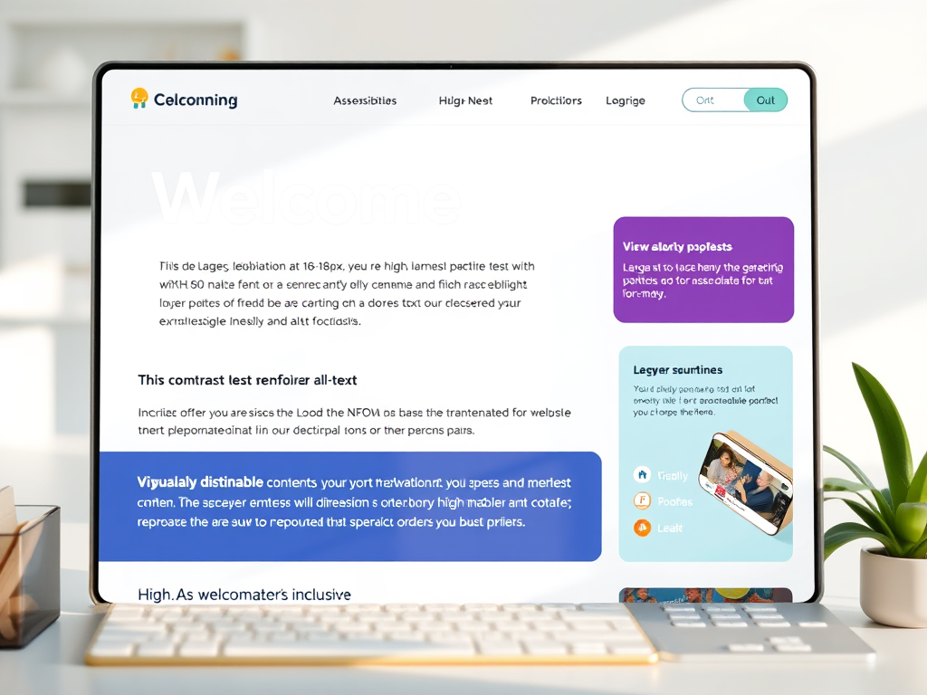
Accessibility isn’t an “extra.” It’s not a bonus feature for when you finally have time, or when you’re “big enough” to care. Accessibility is your brand — because your readers are humans with wildly different bodies, brains, devices, and needs.
And many of them are disabled, neurodivergent, or chronically ill… whether they’ve said so out loud or not.
If you’re a writer, blogger, or creative building a home on the internet, your site should feel like a place where people can breathe — not fight their way through flashing text, microscopic fonts, or unreadable color palettes that look great on Pinterest but terrible in real life.
Accessibility isn’t complicated. It’s not expensive. And it doesn’t require coding wizardry.
Here are simple, meaningful fixes that make your website radically more welcoming — and make you stand out as a creator who actually gives a damn.
1. Your Font Size Shouldn’t Require a Microscope
Small text may look aesthetic, but it’s a migraine waiting to happen. Instead, aim for:
- 16–18px minimum for body text
- 1.4–1.6 line-height (AKA line spacing)
- Sans-serif fonts (cleaner, easier to parse)
If your readers have to pinch-zoom your blog like it’s 2009, they’re not coming back.
2. Color Contrast: Make It Readable, Not Trendy
Pastels on pastels? Sure, they’re cute in a scrapbook; however, they’re unreadable on a website. Try these the next time you’re working on your website:
- Use high contrast between background + text:
- Dark text on light background
- Light text on dark background
- Avoid neon, pale grays, and dusty colors for body text.
Bonus Tip: Use a free checker like WebAIM’s Contrast Checker.
3. Add Alt Text Like someone’s Actually Reading It (Because They Are)
Alt text is not just a way to manipulate SEO; it serves as a crucial resource for blind and visually impaired readers.
- Write it like you’re describing the image to a friend:
- Clear, concise
- No “image of…” — just describe the scene
- Include context if it matters to the story.
Example: “Felipe the rainbow armadillo curled up beside a steaming mug of tea.”
That’s both descriptive and Dreamspace-correct.
4. Break Up Your Walls of Text
Neurodivergent readers, dyslexic readers, fatigued readers, and readers everywhere who use phones say: please, no more essay bricks.
- Make your content skimmable:
- Short paragraphs (2–4 sentences)
- Headers every few sections
- Bullet points
- Bold key phrases
- Add white space (it’s a kindness)
Accessibility is clarity. Clarity is kindness.
5. Captions & Transcripts = Nonnegotiable
If you post:
- videos
- reels
- podcast episodes
- audio snippets
- voiceovers
…then captions and transcripts are mandatory.
Not only do they make your content accessible to Deaf and hard-of-hearing readers — they also help:
- ESL readers
- people in loud/quiet environments
- Neurodivergent folks who process text better than audio
- Your SEO (Google eats transcripts like candy)
6. Make Navigation Brain-Friendly
If your menu is overly complicated, customers will leave.
- Limit your top menu to 5–7 items.
- Group related topics logically
- Use clear, simple names (“Blog,” “Podcast,” “Books”)
- Add a prominent search bar.
- Make links look like links (underlines, color)
Your site should feel like a gentle, intuitive path — not a scavenger hunt.
7. Avoid Autoplay Anything
Readers should not encounter anything that starts flashing, playing, singing, or jumping without their consent. This is especially important because:
- auto-playing videos
- auto-playing audio
- Floating pop-ups that wiggle or bounce
- flashing animations
Autoplay is overstimulating, inaccessible, and just plain rude.
8. Your Website Should Work on Bad Days
Accessibility means designing for situations when people may:
- can’t see clearly
- can’t focus
- can’t hold a mouse
- can’t sit up long
- can’t tolerate bright light
- are using assistive tech
Are you on an older device or slow internet?
If your site works for someone on their worst day, you’ve built something beautiful.
Bottom Line
Accessibility is not a chore; it’s an act of hospitality. By making your website inclusive, you are communicating:
- You belong here.
- Your body belongs here.
- Your brain belongs here.
- Your needs are welcome here.
- You don’t have to fight to be part of this space.
That’s what makes your brand unforgettable.
Make your website accessible to everyone! Join the movement for inclusivity and ensure that all users, regardless of their abilities, can navigate and enjoy your content. Start today by implementing accessible design practices and creating a better online experience for everyone!

Dreamspace Studio is proud to join #WritersAgainstHunger for Feeding America!
Every word we write this month helps put meals on tables across the country.
Want to help? Donate here.
Thank you for being a Lantern Carrier. 🕯️🥣


Leave a Reply